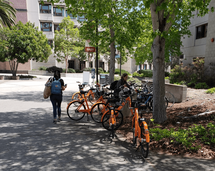
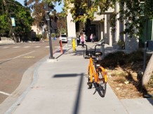
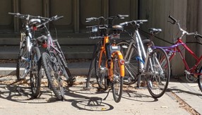
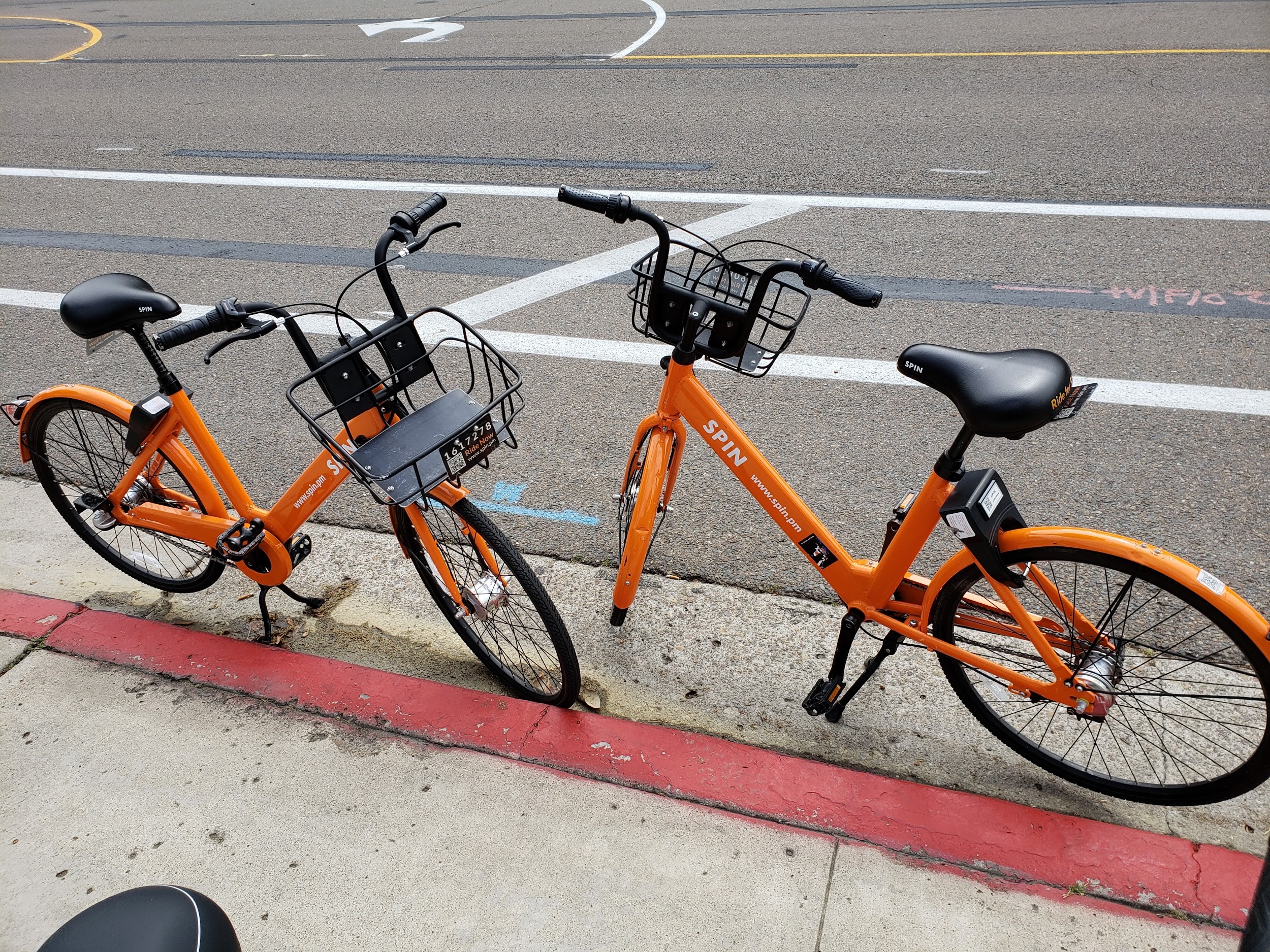
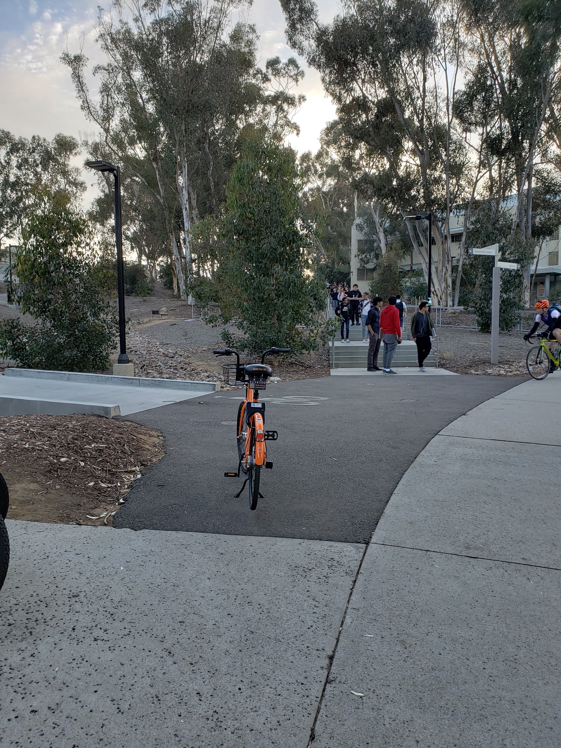
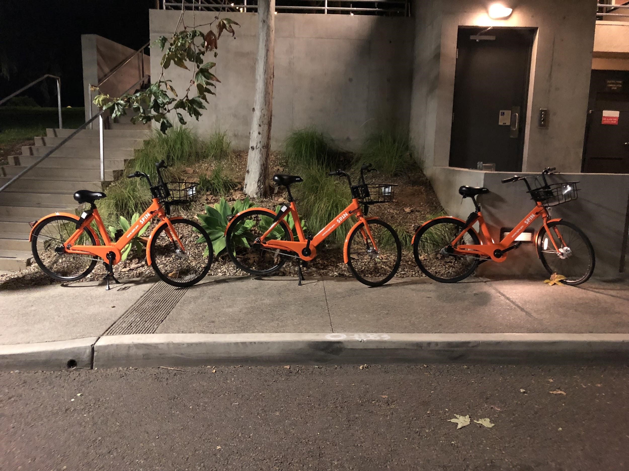
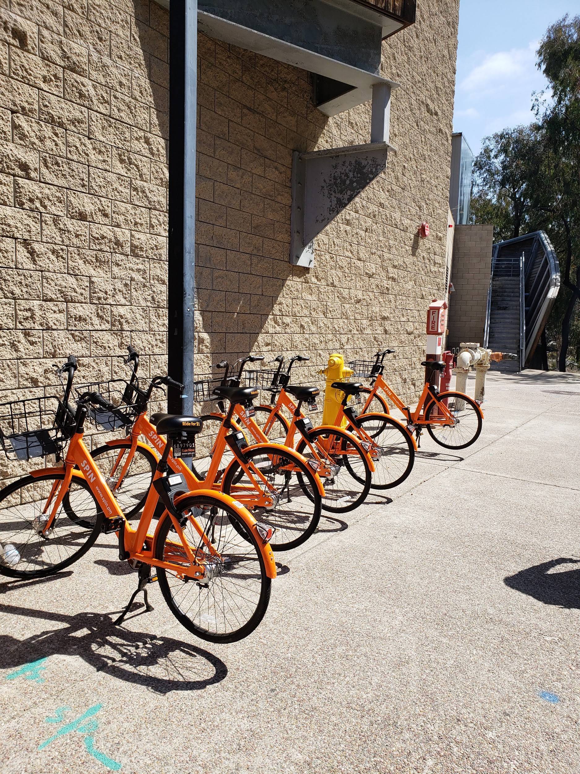
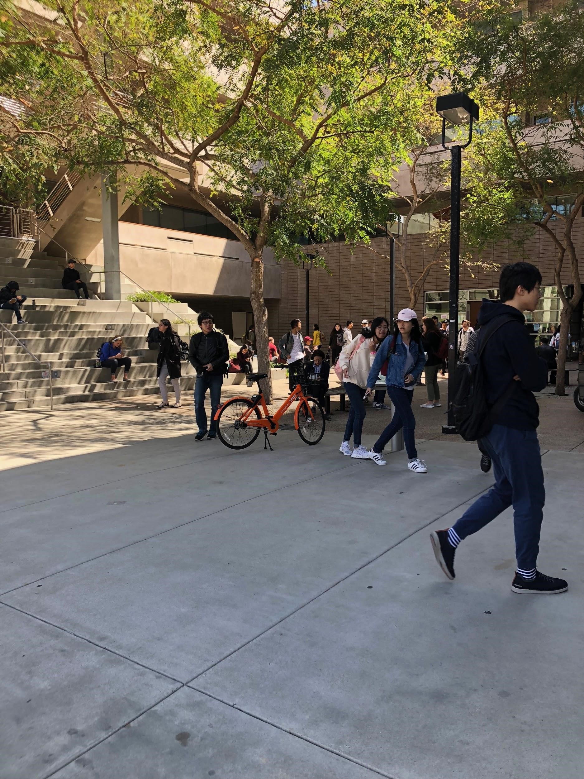
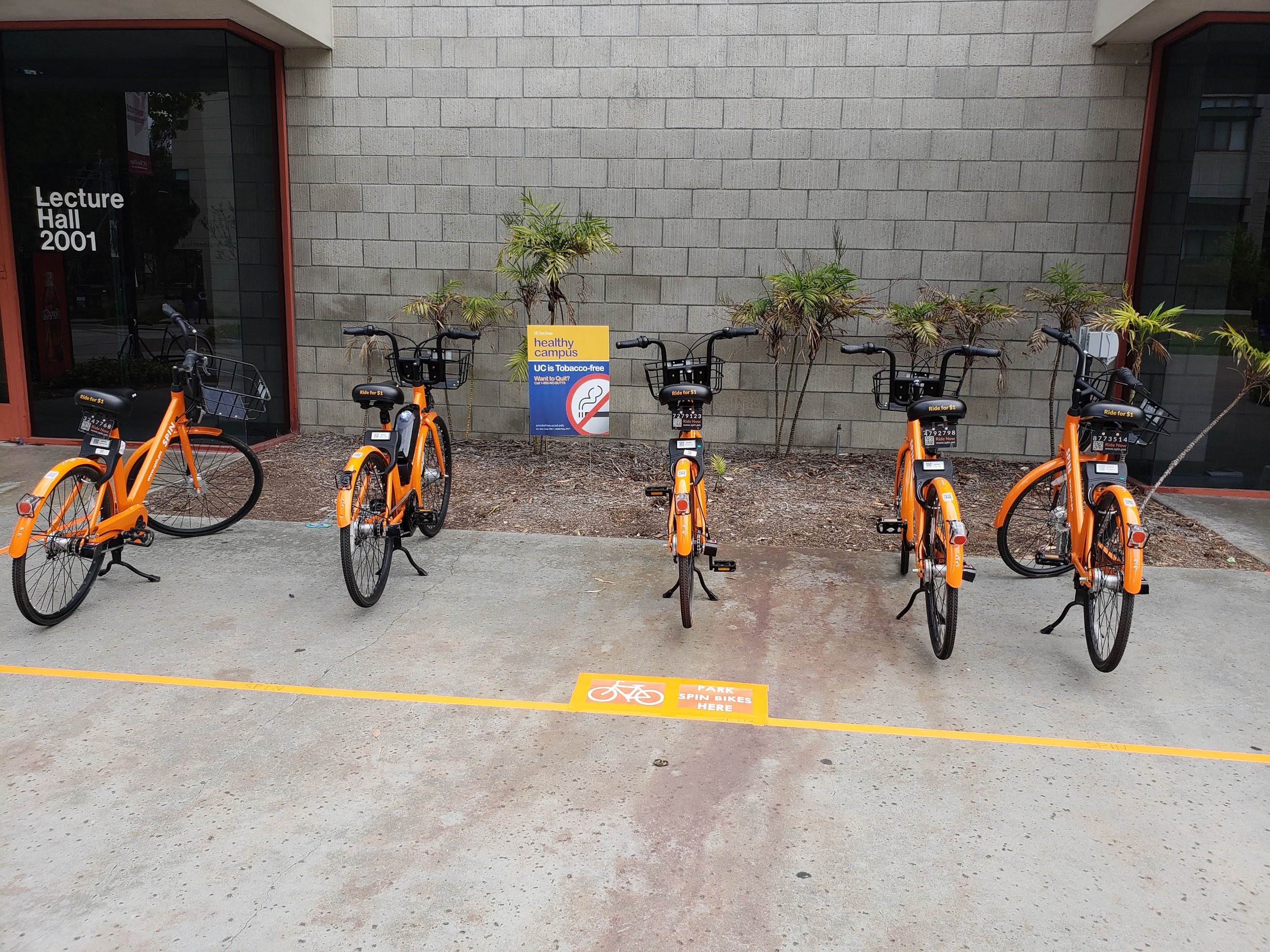
Spin bikes, the new rentable bicycle at UCSD, were parked in a way that crowded roads, sidewalks, and, ultimately, became hazards. Our group sought to improve the way these bikes were parked and improve the overall pedestrian experience.
UX Designer, Interviewer, Storyboarder, Prototyper
Redesigned parking experience
As avid cyclists, we were excited by the topic of bikes on campus and set out to interview as many bikers as we could. During these discussions, we were able to extract common issues that bikers ran into on campus (such as parking). Through our research, we discovered that many of these issues stemmed from the rental bikes that recently popped up on campus (Spin bikes). Here are a few of the related issues:
Since Spin bikes are dockless bikes, Spin bike users are given the freedom to park anywhere in convenience to the user. The convenience of the dockless feature of the bike provided problems to bike owners, pedestrians, and even Spin bike users themselves on campus.
In order for us to completely understand our design problem, we needed to research and interview our stakeholders: regular bike riders, pedestrians, and other Spin bike users.
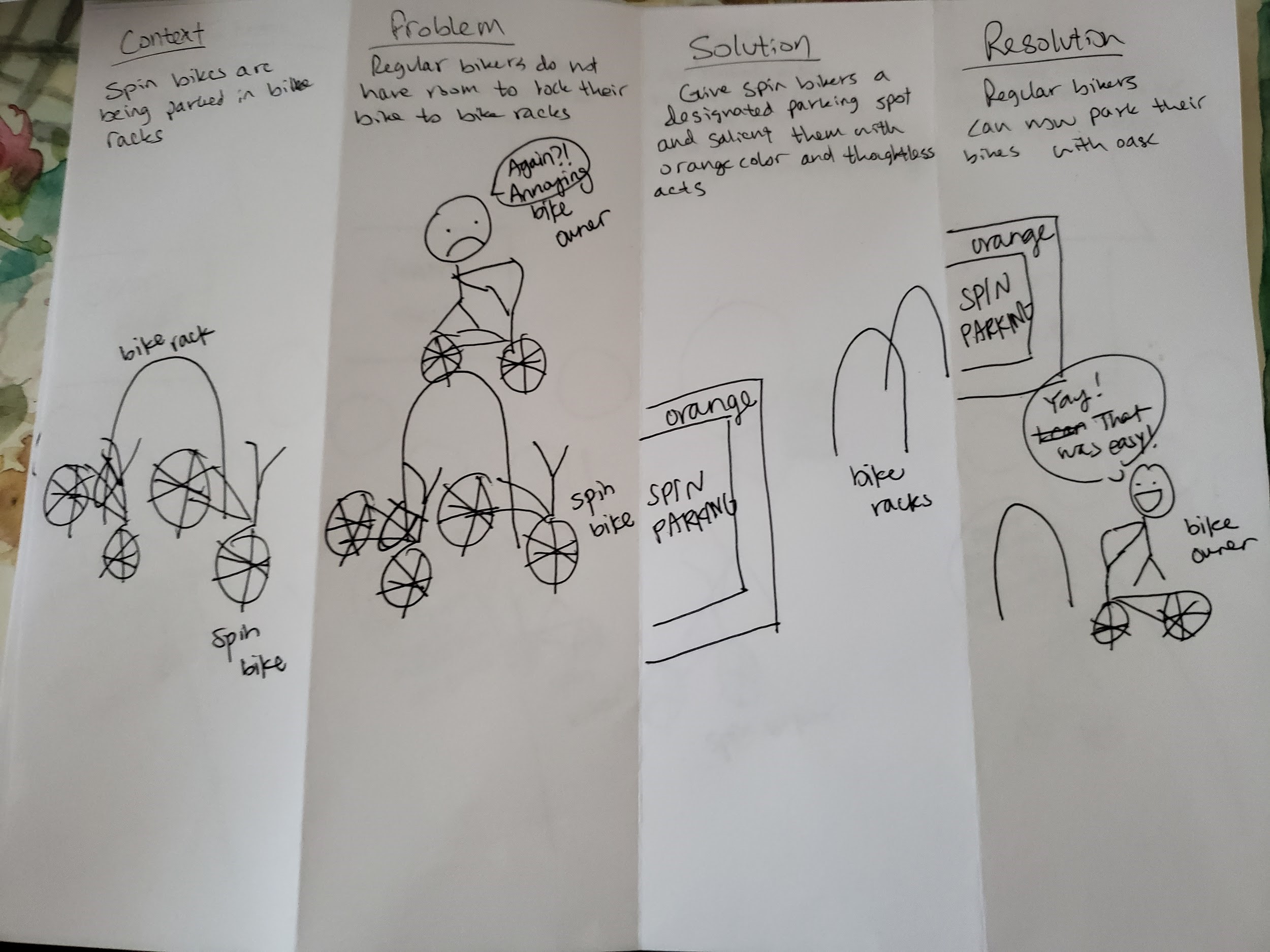
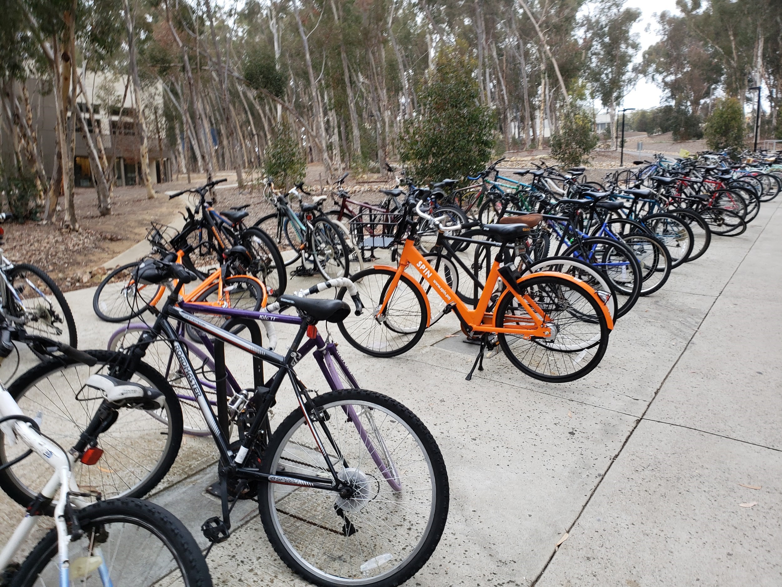
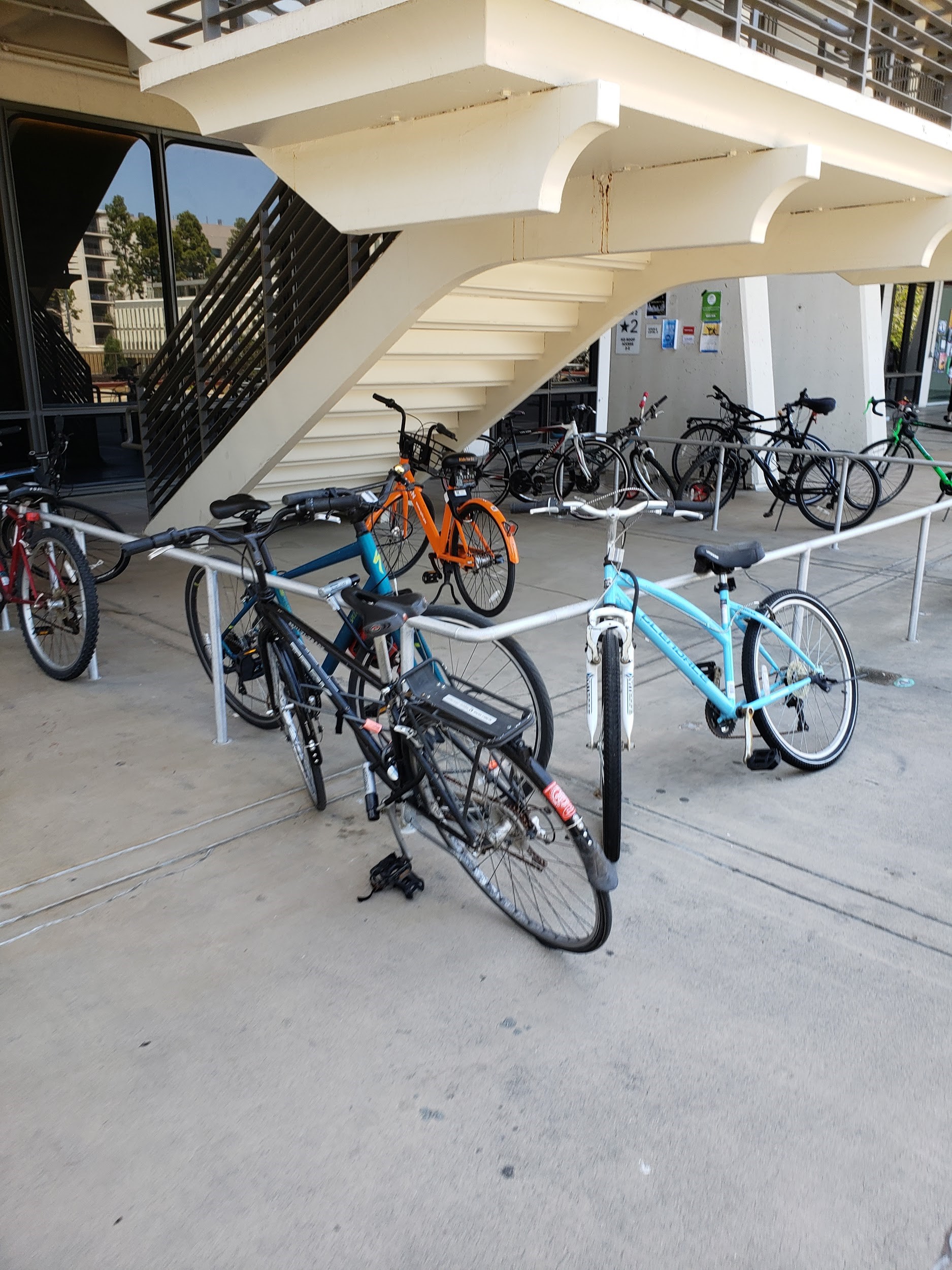
Many Spin bikes were found parked in bike racks primarily used for bike owners to lock their bikes to.
Bikers were annoyed to find Spin bikes parked in bike racks.
Bike owners constantly had to remove heavy spin bikes from the bike racks and carry them out of the way while also holding their own bike.
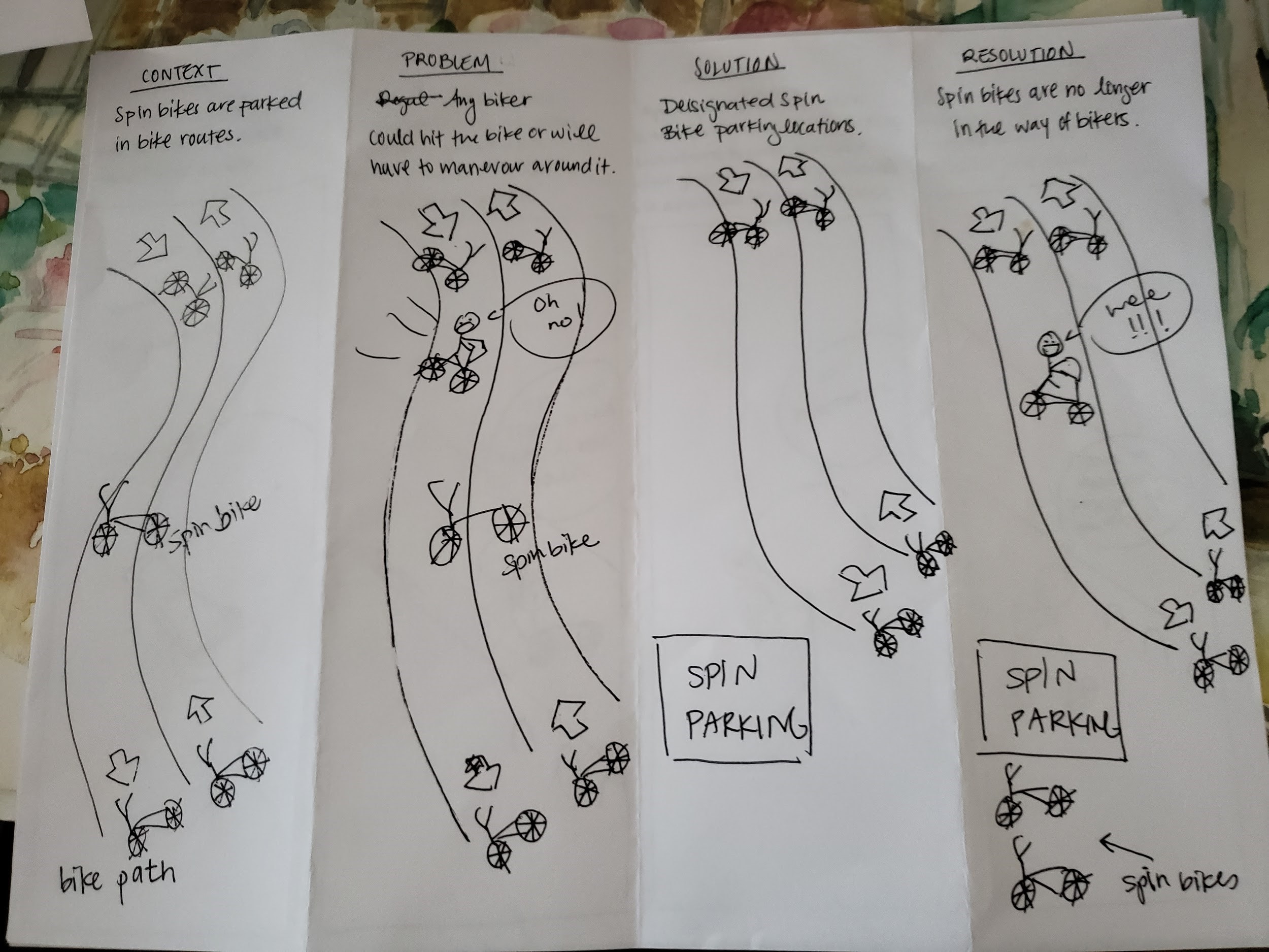
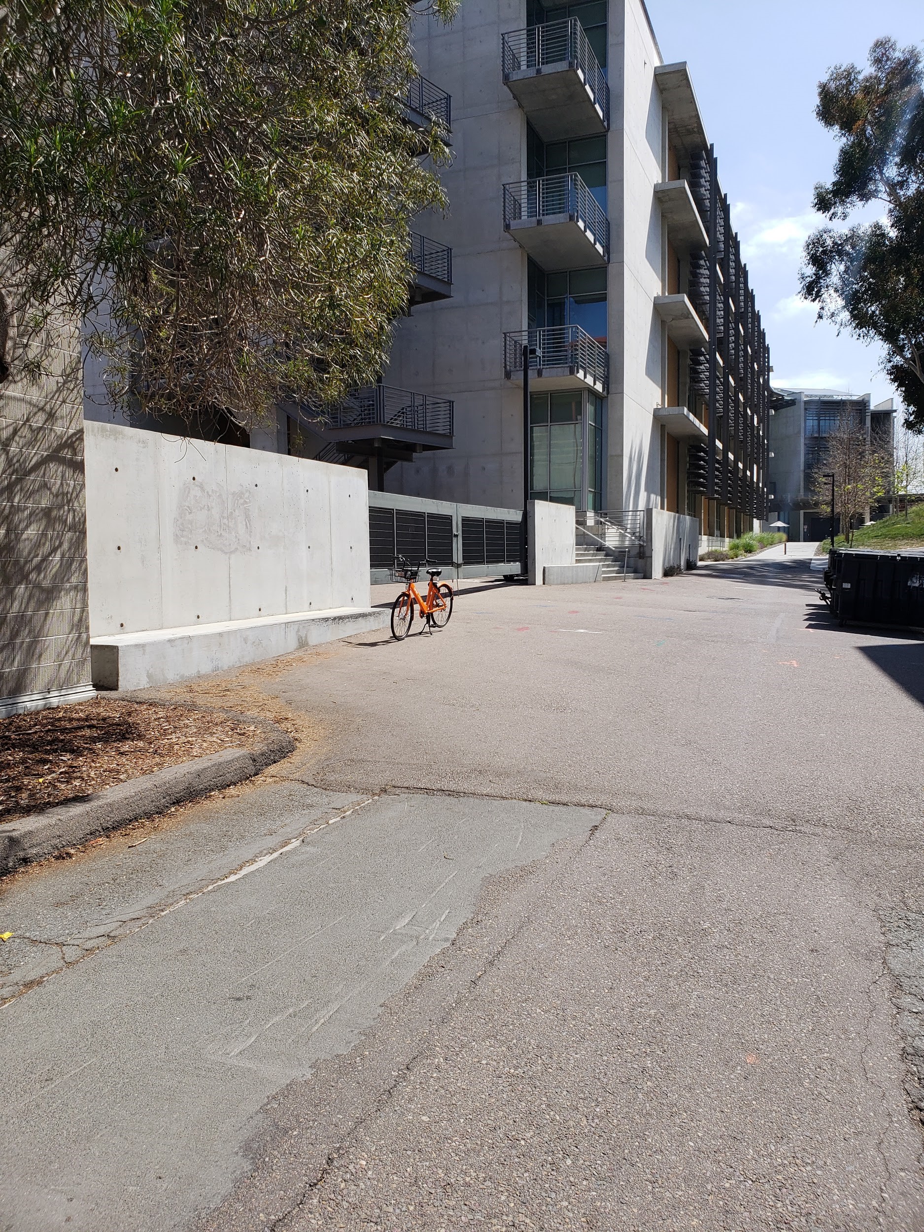
Several Spin bikes were also reported and observed to be parked in and blocking bike paths, creating hazards for bike riders.
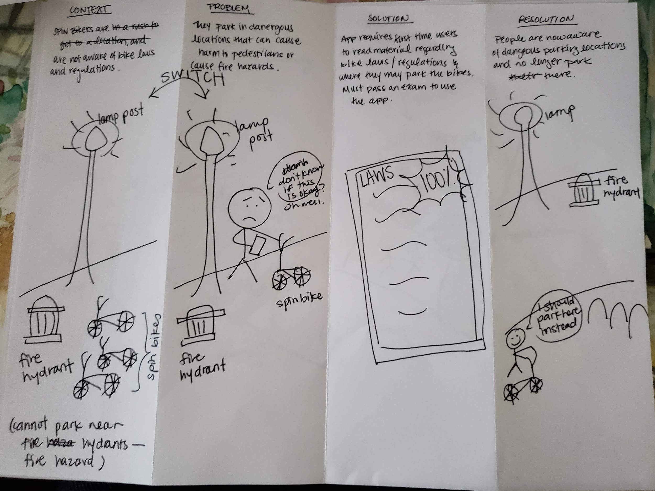
Many misplaced Spin bikes were parked in main pathways primarily used by pedestrians, creating blockages and hazards.
Pedestrians find it harder to get to places they would like to be because they would have to be cautious of Spin bikes in their way
Assuming safety on walkways, it is possible that pedestrians can collide with Spin bikes because they are obstructing the walkway.
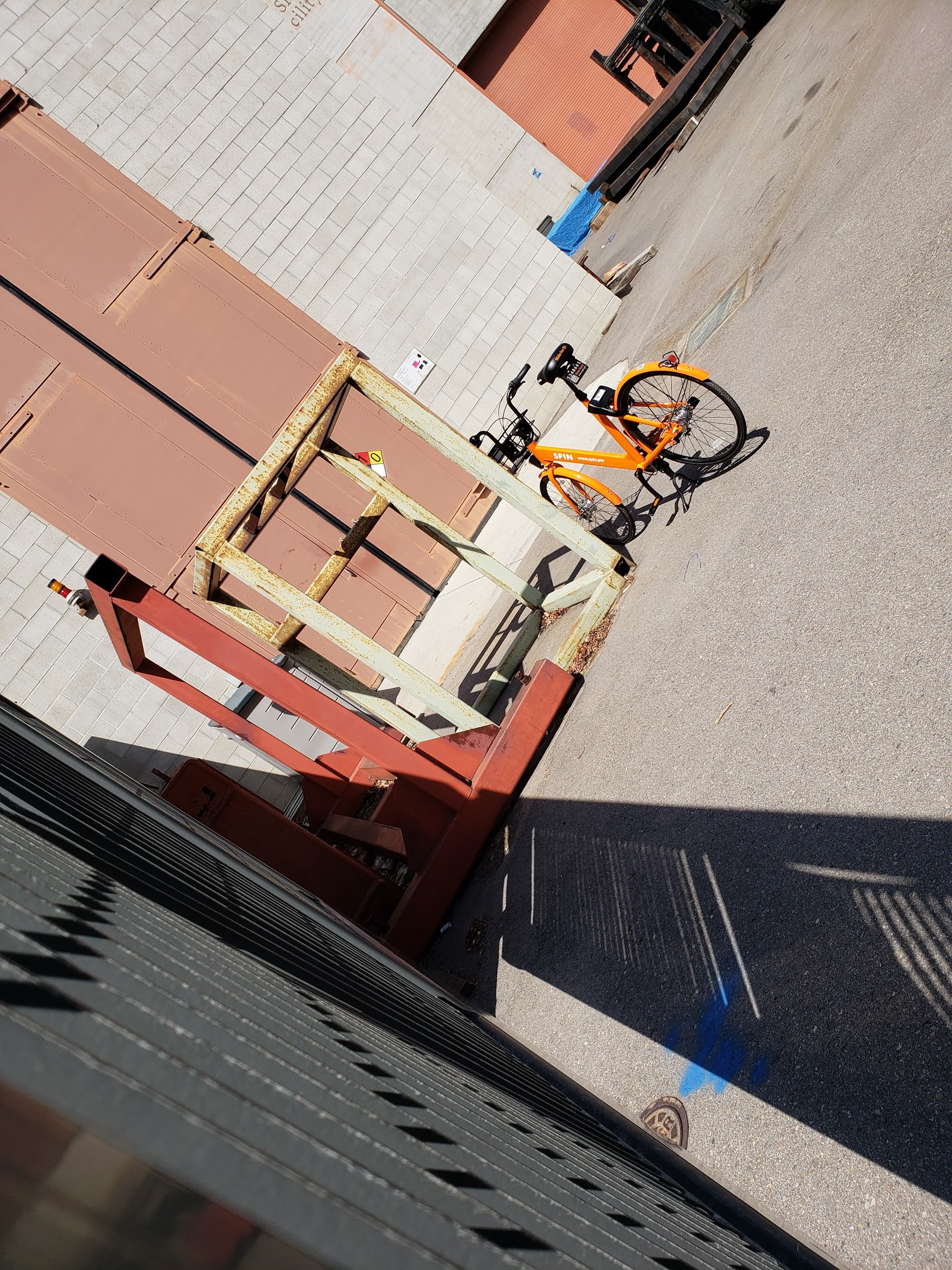
Spin bikes end up blocking communal areas such as sidewalks, benches, doorways, and fire zones.
Spin bikes have been found in random locations, making it harder for Spin bike users to locate a Spin bike to use.
Along with a faulty app, some Spin bike users have admitted that sometimes Spin bikes are out of reach and not easily accessible.
people generally use Spin bikes to get to places faster, more time is wasted on the first step of locating a bike to use.
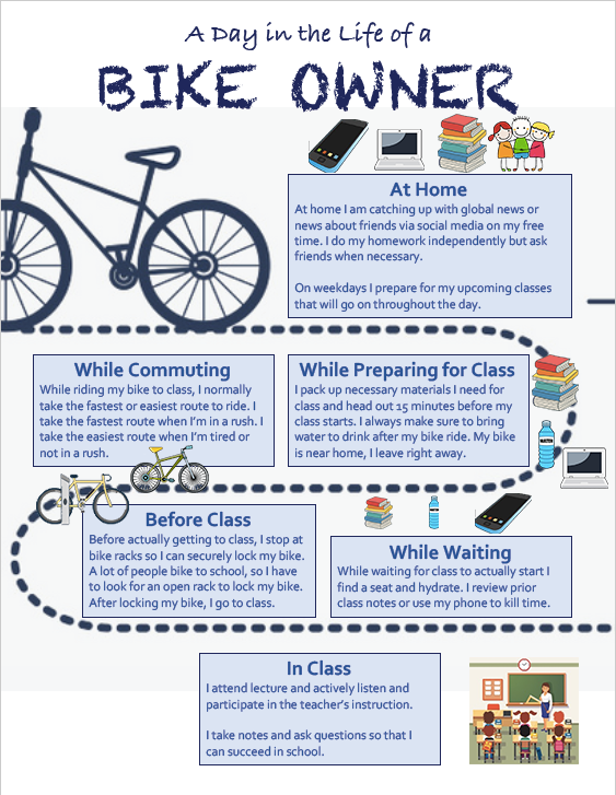
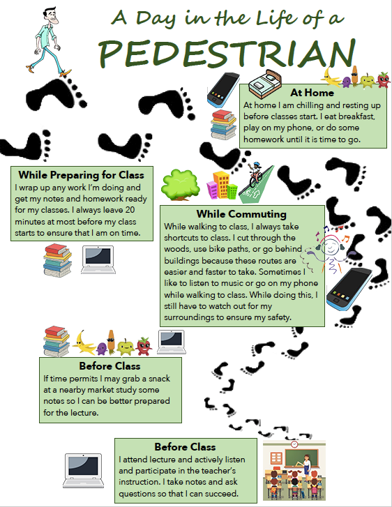
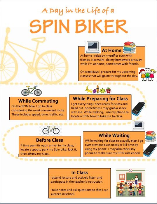
We decided to base our prototype off of convenience, safety, and space; we identified these values in the process of making the Identity Models, Day in the Life Models, and Personas that we created for our stakeholders
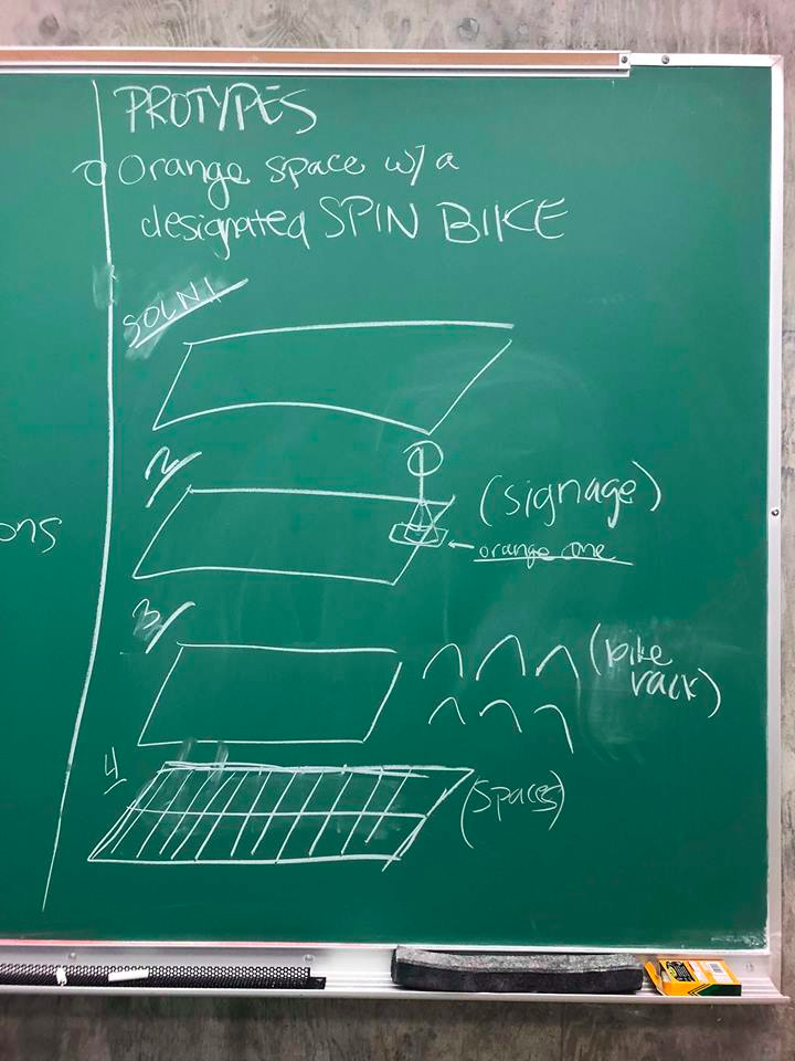
We managed to think of some potential ideas, including: designated parking spaces and signage in popular Spin parking locations as this seemed most suitable and appropriate to serve the values of our stakeholders; we noticed this while making our storyboards Paying attention to the resolutions of the storyboards involving designated parking spaces, we took the most common solution and began to formulate ideas for our prototype. This prototype idea would provide Spin bike users convenience since the designated parking spots would be near popular locations. We decided that the designated Spin bike locations would be separate from the personal bike racks. Sharing the space would cause Spin biker users to have to go through several bikes to grab a single Spin bike.
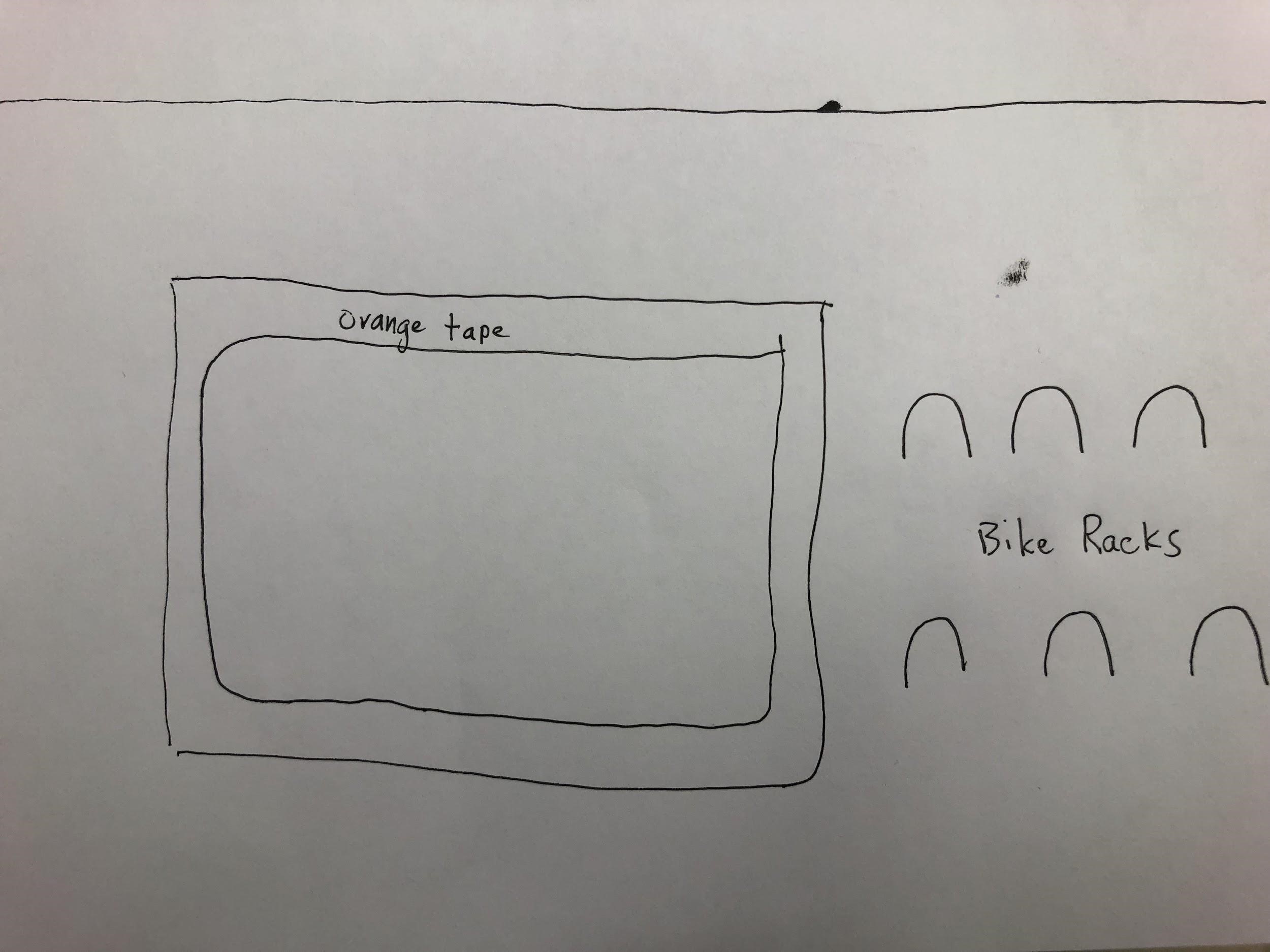
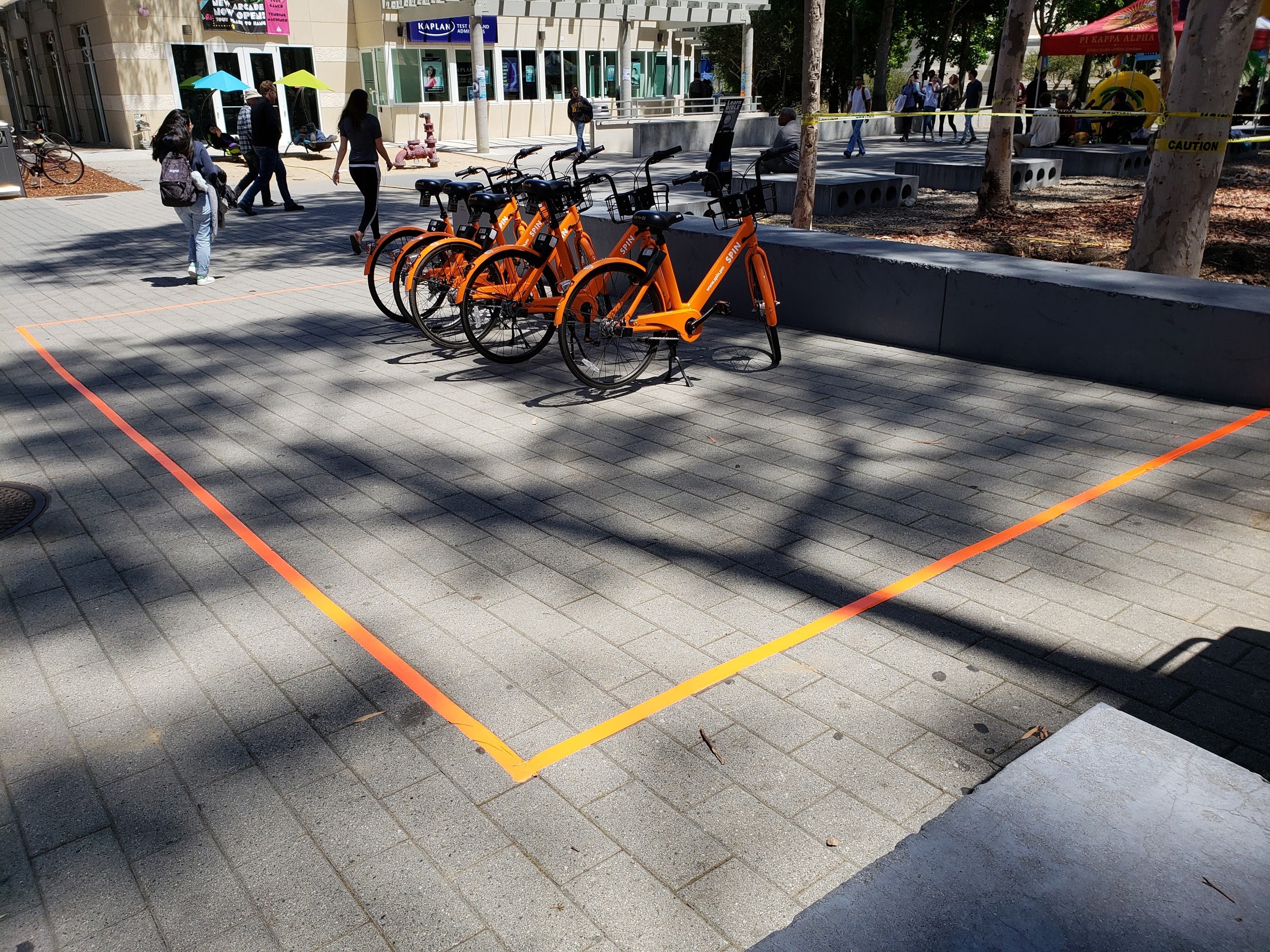
Ruling out paper and chalk (due to their unreliability), we decided that duct tape was feasible for this prototype. Duct tape was easy to obtain and we did not need a large supply, like we would for paper or chalk. Instead of making a shaded box made of orange duct tape to signify designated parking, the duct tape was used to outline a box where Spin bikes would be placed inside. This idea would be noticeable enough from a distance and the quality would not degrade as fast as the quality of paper or chalk. It would also allow for very nice straights lines to be created to give it that “official” feel. Sketches created throughout our ideation and prototyping process can be found in (Portfolio; Prototype Sketches).
We made sure that our prototype was near high Spin traffic areas so that more Spin bikers would use it. It would also need to be out of the way of sidewalks and major walkways such that the Spin bikes are not hazardous or cumbersome by blocking pedestrians and bike riders. The prototype would also need to be out of bike racks but still near them. Bike riders dislike when Spin bikes are left in the racks as they do not need to be locked and ultimately end up blocking valuable bike parking spots. And finally, after several iterations, the prototype would need to as close to classrooms as possible. Spin riders used the parking spots near lecture halls much more than the spots near Geisel (library) and many told us that they appreciate a parking spot closer to lecture halls.
Our final design prototype consisted of a large box of orange tape that would designate a parking area. It was also subtle to not be distracting while maintaining a sense of authority. A laminated sign was taped at the base of the box to accurately dictate what the purpose of the box was. After several days of observation, we found our final solution to be quite successful with many people utilizing the designated space.
If we had more time to iterate and implement, we would have liked to create a more permanent solution such as colored bricks or a constructed Spin bike zone. Our design was also intended to be used with an 8-10 foot tall pole to indicate from a further distance where a Spin bike zone was located.
Spin bikes were a relatively new rental phenomenon on the UCSD campus and while they may have been a problem at the time, the future remained unknown. It would have been immensely helpful to work in collaboration with school administrators to create a more permanent solution that would satisfy all future rental needs as opposed to the solution for just Spin bikes.
As this was my first UX design-related project, I learned a lot on how to gather critical information and use that to understand the needs of the stakeholders.
The best solution came from observations and countless interviews.
Even though we started with nothing (no problem to solve), we ultimately found an issue after researching an interseting topic.
Several months after the conclusion of the project, the design prototype was still in place and being utilized.
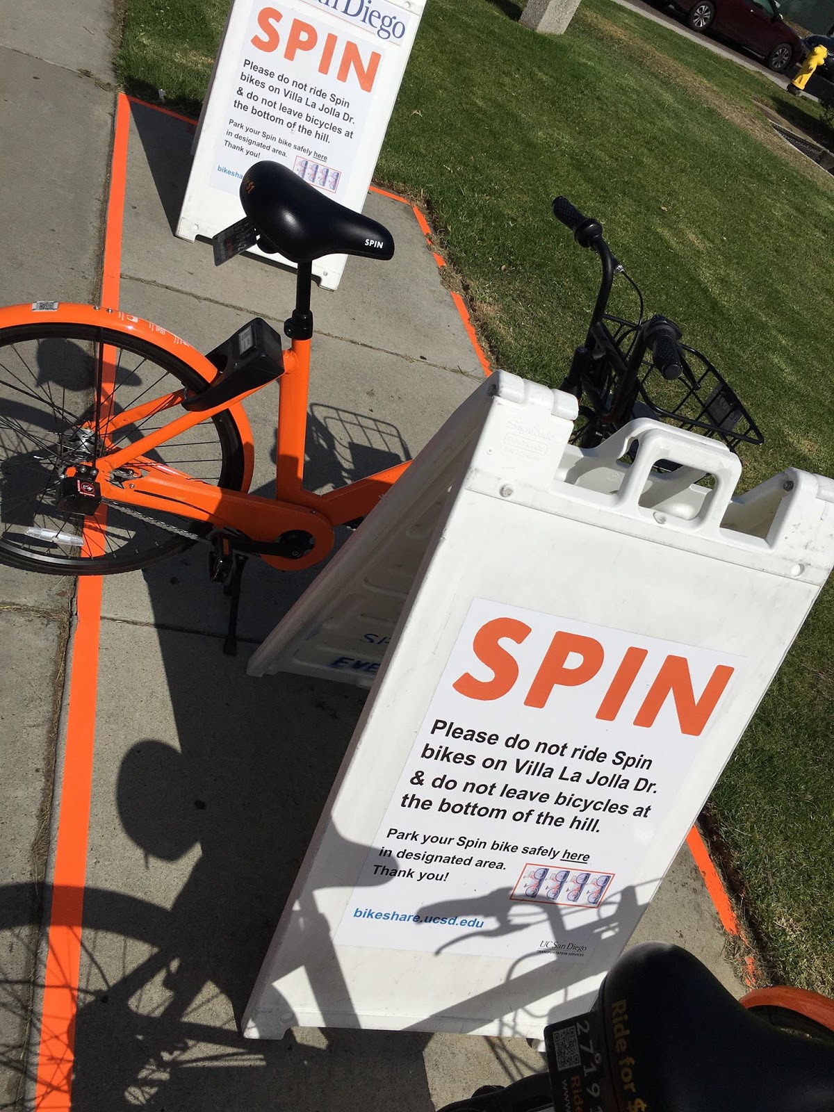
It was especially pleasing to see a design implementation, albeit with a bit less UX design (look at the space taken by those signs), done by the school following the release of our design.